Creating Flexible Contact Snippets in OU Campus
By Jeanine | 2020-05-29
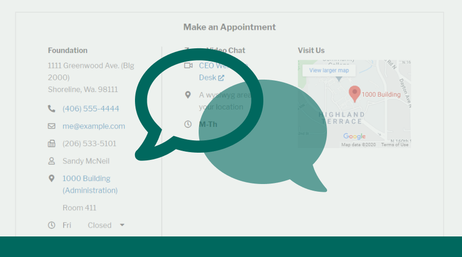
Creating a system to deliver consistent contact information is an opportunity to help your higher ed website shine and encourage students to reach out! In the following project with Shoreline Community College, we developed a standardized contact region and the tools to manage it using OU Campus.
Making the leap to apply for a new school can be exciting but scary. Often prospective students are looking for answers prior to clicking that magical Apply Now button—but what if they can’t find the information they need? Who can they contact?
Creating a system to deliver consistent contact information is an opportunity to help your higher ed website shine and encourage students to reach out! In the following project, we developed a standardized contact region and the tools to manage it using OU Campus.
How to present contact information
Working together with Adam Staffa, Assistant Director of Web Strategy at Shoreline Community College, we sought to create a more structured contact box—one that could be consistent across the website and help people find the contact information they needed more easily and reliably.
Our goals for the updated contact box included:
- Standardizing the most common types of contact information for consistency
- Offering enough flexibility to support additional, nonstandard contact information
- Allowing content editors to easily create and update contact information without needing to modify any code
Previously, the contact box contained information presented in a variety of ways—many columns were filled using inconsistent headers and labels. This isn’t the experience we wanted.
As advised by the Interaction Design Foundation, consistency creates trust. If we could formulate a more consistent experience, we could build on the trust that our students should feel when they visited the website.
“…Consistency creates trust. It creates an experience which users can rely upon every time.” —Interaction Design Foundation
Therefore, similar to when Shoreline Community College redesigned its website in 2018, we needed to do some groundwork first before diving in and creating this functionality within OU Campus.
After strategizing and evaluating possible options, Adam developed a diverse list of possible contact box structures using Axure. His examples highlighted the variations of style and contact types, including:
- Phone
- Fax
- Person
- Location (Custom content or dynamic lists)
- Hours (Custom content or dynamic lists)
- No format
Because of Shoreline Community College’s recent redesign, it was straight-forward to move the wireframes into the development website using the existing design library.

Next, we needed to decide how best to manage the designs using OU Campus by considering the following questions:
- Should the contact box be the same per section? If yes, use an .inc file and set up a directory variable; if no, use a snippet or component in an Editable Region.
- Would any of the content be centralized or dynamic? For centralized static content, pull information from an asset or manually code it into the XSL transformation. For dynamic content, consider how this can be best managed using select-lists and XSL transformations.
- Should the contact box be an include, component, or snippet? There are definitely trade-offs between each. If the contact information would be the same for an entire directory, use an include. Otherwise, a component or snippet would offer flexibility on a page-by-page basis.
Bringing the design into OU Campus
For this implementation, we decided the contact box could vary per page. Because of the limitations and rigid structure of components, snippets offered the ideal balance of structure and flexibility for our contact boxes.
Snippets offered the ideal balance of structure and flexibility for our contact boxes.
With the code complete, we brought the HTML into the snippets.xsl and created new table transformations for the snippets.

Because we wanted content managers to be able to easily manage the various contact types, we implemented a limited list of choices in our contact list snippet using OmniUpdate’s guide for adding select-lists into snippets. The options will now be to be managed and modified using JSON files.
Decisions, decisions
Some takeaways from this project included:
- Use one column for managing the contact information—adding and removing rows as needed for multiple columns—allows content editors to manage the information in each cell without having to horizontally scroll when content becomes too wide.
- Use icons to help users find the information they need faster as icons improve the scannability of the content.
- Have a system that can be modified easily. During development, we realized the need for an additional video chat icon and were able to update JSON and XSL files easily without needing to adjust any existing snippets.
- Take the time to determine the right implementation for your school’s needs. For example, current limitations on components make it hard to search for certain content (such as outdated emails) and replace them. Find-and-replace is easily done if you’re using snippets!
Resources
If you’re interested in learning more, reference the code examples for implementing the contact box snippets into your college or university’s website. If you’re not sure how to implement a similar feature into your site, contact me for assistance in implementing your design into OU Campus or to discuss possible improvements to your website and OU Campus editing experience.


